Have you noticed how some places and spaces can make you feel instantly at ease, while others can cause you to feel tense or anxious? It’s no secret that our surroundings can influence our emotions, our thoughts and even our decisions.
Sounds, lighting, movement or the lack thereof, the size of the space we’re in, how open or confined the space is — all of these factors have an impact on us, whether we’re aware of it or not. So does color.
Researchers refer to the interplay between colors and moods, behaviors and mental health as color psychology. Businesses from restaurants and hotels to supermarkets and spas take into account colors that affect mood when designing their interiors and exteriors.
On a broader scale, designers employ color psychology when creating the look of logos, marketing materials and product packaging.
What Is Color Psychology?
An article by Insights Psychology defines color psychology as “the study of how colors affect human behavior, perception and emotional responses.”
“It sits at the intersection of science, psychology and design — revealing why certain colors trigger specific feelings,” the article notes.
We commonly use idioms containing mood colors to express feelings, such as “seeing red” to describe someone who’s angry or “feeling blue” to denote sadness. Yellow is often associated with cheerfulness; we describe someone who’s typically happy as having a sunny disposition.
What Do Specific Colors Represent?
The Insights Psychology article includes a color emotion guide explaining how certain colors can change how we feel and behave. While the following list provides each color’s symbolic effects, the article provides a more in-depth look at specific influences colors can have on us.
- Black: Power, elegance and mystery
- Blue: Calm, trust and stability
- Green: Balance, growth and harmony
- Purple: Creativity, luxury and mystery
- Red: Energy, passion and urgency
- White: Simplicity, purity and clarity
- Yellow: Optimism, warmth and attention
The article points out that color psychology meanings can vary among cultures. One example is white: While it’s often associated with pureness in Western cultures, in many Eastern traditions it’s a color of mourning.
Why Do Colors Influence Our Moods?
Along with the cultural conditioning we experience regarding color, our brains associate certain colors with our memories, both positive and negative.
Color affects our brains physiologically as well, leading to changes in heart rate, blood pressure and the production of hormones such as serotonin.
In addition, we use color as subconscious cues to evaluate our environment. As Nicole Torres writes in this article for The Decision Lab, “Soft, muted tones like beige and pastel colors are often used in healthcare settings and homes to create a sense of warmth and safety.”
Color Is a Key Component in the Psychology of Interior Design
When creating an elegant, upscale senior living community like The Seville, it’s necessary to understand the psychology of color in interior design. For instance, how does interior design affect mental health, and what roles do different colors play?
In choosing the color palette for our community, the talented team from RVD Associates, the award-winning interior design firm that brought The Seville to life, applied their expertise in working with color’s influence. Along with its psychological impact, the palette complements our coastal lifestyle.
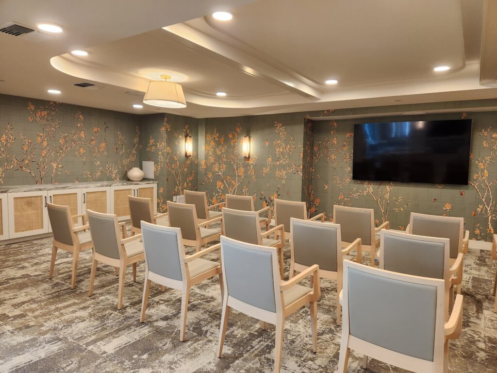
Because soft, cool colors — such as blues and greens — have a calming effect, it made sense to use those tones in common areas intended for relaxation, like the lounge, theater and Paloma, our tended beer and wine bar.
Green is also the color of health. Combined with abundant natural lighting through large windows and glass doors that invite the outdoors inside, certain shades of green can have an emotionally healing influence similar to that of being in nature.
Warm hues, on the other hand, can brighten mood and evoke a sense of joy. The team incorporated tasteful orange tones as an accent color in spaces throughout the community.
An emphasis on light wood finishes and patterned fabrics in neutral shades strikes a harmonious balance between the carefully selected warm and cool colors, creating a visually appealing interior-scape that also has a positive psychological affect.
As you can see, when choosing textures and colors for seniors there’s no need to be timid. The goal is to create a welcoming environment that’s vibrant without overstimulating.
Ready To Elevate Your Lifestyle?
The Seville is more than a beautiful place to live.
We’re redefining assisted living and memory care by offering concierge services and luxury amenities along with dignified, supportive care.
If you would like to learn more about our approach to wellness-oriented living or experience our community in person, contact us to arrange a visit.
In the meantime, we invite you browse our photo gallery to see more of the artful synergy of our interior design.